You've got a practically infinite palette to work with when it comes to color. Find out how to do it right.
You have a whopping 16.8 million colors to choose from when designing a website. And when you start combining them to form a palette? Your array of choices instantly becomes practically infinite.
To get you started, I’ll dive into the following topics:
Vocabulary – from tints to saturation to warmth and more, we’ll cover the lingo designers use when talking color
Color wheel – a powerful tool for visualizing the relationships between colors
Color schemes – how to use the color wheel to choose your color schemes
Color psychology – the feelings and meanings people often associate with particular colors
Tools and resources – apps and guides to help you master designing with color
Why you should care about color
If someone handed you the keys to your dream car, for free, your head would explode with excitement, right? Of course!
But what if the car was painted in your most-hated hue? Or each panel was a different color entirely? Or if the interior mixed lime green and construction yellow?
You might be a little less excited, right?
Colors have meaning. They impart a tone and emotional impact just like fonts do, and that makes them a powerful design tool.
The vocabulary of color
Before we dive into theory, you’ll need to know the following terms:
Primary colors
The three primary colors used to create other colors.Primary colors form the basis for all other shades. Humans perceive three base colors: magenta, cyan, and yellow. Every other color we see consists of a combination of these three colors in varying amounts, brightnesses, tints, and shades (see below).
Traditionally, we considered red, blue, and yellow to be the primary colors, but research has shown that magenta, cyan, and yellow better describe our experience of color.
RGB and hex
Red, green, and blue used to create other colors.On the web, we use RGB (red-green-blue) and hex values to represent colors.
The RGB color system defines all colors as a combination of three different values: a particular shade of red, another of green, and another of blue. So:
- rgb(59, 89, 145) equals Facebook blue
- rgb(0, 0, 0) equals black
- rgb(255, 255, 255) equals white
The hex color system converts each value to a hexadecimal (base 16) representation, like so:
- #3b599b equals Facebook blue
- #000000 equals black
- #ffffff equals white
Every two characters represents a color value, so for Facebook blue, the red hue is 3b, the green is 59, and 9b is blue.
Hot and cold
Cool and warm colors.Colors also have a “warmth,” and each can be classified as either a warm or a cool color.
Warm colors contain higher amounts of reds and yellows. They can invoke a sense of warmth and passion in a design. They can also feel very aggressive and bold, reminding us of the international stop sign. That’s why red is often used in error messages.
Cool colors contain higher amounts of blue, evoking chilly climates, ice, winter, water, nighttime, death, and sadness. They can carry connotations of loneliness, coldness, and fear. Cool colors also less aggressive and much more soothing. Think of a blue sky, or crystal clear blue waters on a beach. Relaxed yet?
Temperature
Increasing an image’s temperature means increasing its orange levels. It generally makes an image look warmer and happier, similar to how the world looks happier when the sun casts its orange glow upon it. In contrast, reducing an image’s temperature makes it look colder and less inviting, like an overcast day.
Tints and shades
A tint results from adding white to a color—a shade when you add black. Tints and shades let you create monochrome color schemes by adding varying levels of white and black to a base color.
For example, if your base color is #8dbdd8 (a lightish blue) as seen in the image below, you can create a monochrome scheme by choosing two tints (two brighter blues) and two shades (two darker blues).
I built this monochrome color scheme from #8dbdd8, using COLOURCODE.
Saturation, hue, and lightness
Saturation describes the intensity of a color. Increasing saturation makes the color richer and darker, while reducing saturation makes it look faded and lighter. When we say “light blue” or “dark green,” we’re describing changes in saturation.
Hue defines the degree to which a color can be described as similar to or different from red, orange, yellow, green, blue, indigo, and violet (the colors of the rainbow). So when you describe a color as “greenish blue,” you’re defining it in terms of two hues.
Lightness, also known as value or tone, defines the perceived brightness of a color compared to pure white.
The HSL color scheme. Adapted from "Munsell-system." Licensed under CC BY-SA 3.0 via Commons.
The color wheel
The color wheelA basic color wheel contains the 12 standard colors used to create color schemes. Each slice of the pie represents a family of colors that can be achieved with different saturations, hues, tints, shades, and mixes of neighbouring colors. The combination colors (e.g., yellow-orange) result from mixing equal amounts of the base hues (yellow and orange).
Red, yellow, and blue are the primary colors. Violet, orange, and green are the secondary colors. Everything else is a tertiary color, a mix of primary and secondary colors.
Designs use the color wheel to choose color schemes, which come in four flavors.
The 4 kinds of color schemes
Designers create color schemes by pairing multiple color families from the color wheel. This usually works best when you follow one of the following patterns.
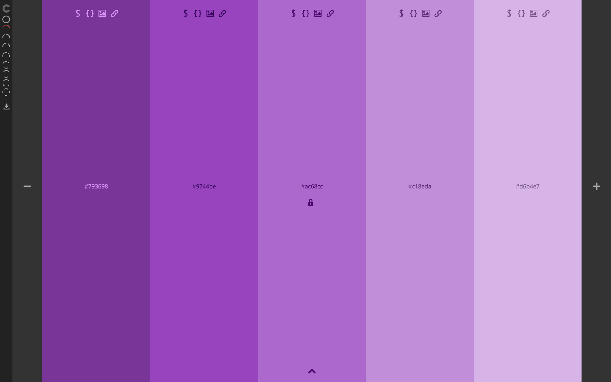
1. Monochrome
A monochrome color scheme consists of various tints, shades, and saturations of a single base color. They’re very cohesive, but run the risk of becoming monotonous.
A monochrome color scheme based on purple.
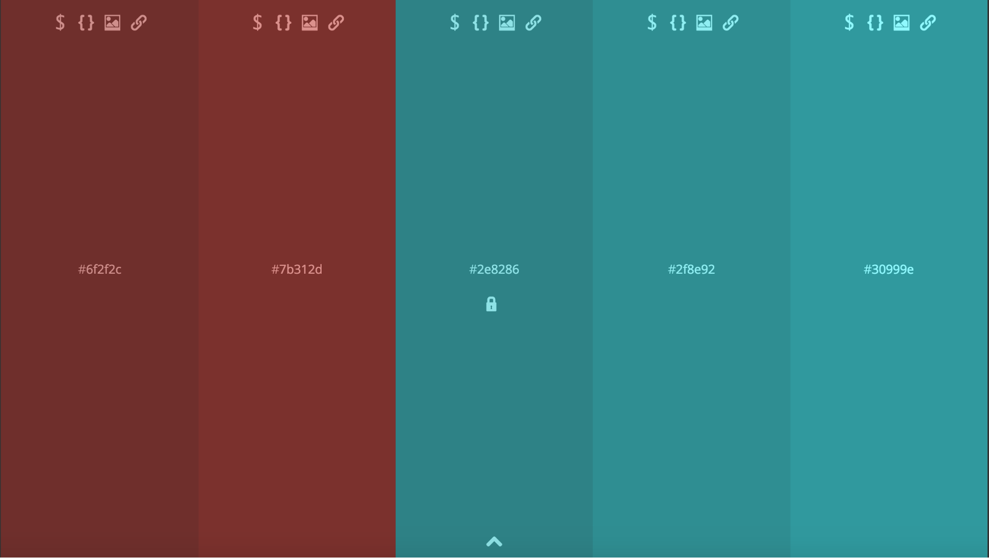
2. Complementary
Complementary schemes are based on two colors from opposite sides of the color wheel. Because the two hues will be wildly different, such schemes can very impactful and noticeable.
Pro tip: Pick a complementary color for your calls to action. Using the scheme below, if your page background is mint green, you might use the pink for your CTA button.
Complementary color scheme based on shades of green and red.
3. Analogous
Analogous schemes feature three colors that sit next to each other on the color wheel. Because of the tonal similarities, these schemes can create a very cohesive, unified feel, without the monotony of a monochrome scheme.
Analogous color scheme based on red, orange and yellow.
4. Triadic
To make a triadic color scheme, draw an equilateral triangle (a triangle where all three sides are the same length) on the color wheel, and select the three colors at the points of the triangle. This creates a diverse, yet balanced, scheme.
Triadic color scheme based on purple, beige, and green.
Color psychology
Every color has its unique tones and meanings. By carefully selecting your colors, you can reinforce the overall message of a site.
Note: Color meanings can vary dramatically across cultures and regions. The following descriptions hold mostly for the United States.
Red
This vibrant, aggressive color can convey a variety of meanings depending on context, but it does it all with power and flair. Combine it with black for a masculine, aggressive feel perfect for a sports car. Pair it with whites and golds, and it speaks of love and passion. Red also represents danger—think stop signs—and blood—think The Red Cross.
Orange
Warm, but less aggressive than red, orange is hard to miss—which explains its use in construction, safety, and hunting equipment. It also practically screams fall, pumpkins, and Halloween. Orange’s warmth can evoke a fun and energetic atmosphere.
Yellow
Yellow represents the sun, warmth, and summertime. It’s also the most visible color on the spectrum, so it really jumps out at you. It’s especially eye-catching when combined with white or black, as it is in safety equipment, school buses, and taxis. Be careful with it, though, as many people it irritating.
Blue
Blue evokes the celestial, the tropical, and—oddly—the professional. Given its long association with water, we we think of blue as refreshing and cleansing. Darker shades of blue, however, can invoke sadness. There’s a reason we call it “the blues,” after all.
Green
As the color of most plant life, green conveys a sense of growth and health, making it perfect for organic, environmentally friendly, and healthy products. Combine it with blues and browns to capture nature. Green also represents wealth and finance in the U.S.
Brown
You won’t see much brown on the web, probably because it implies dirtiness. But it’s perfect if you’re looking to create a sense of earthiness and luxury, perhaps for a sophisticated fashion site.
Purple
In ancient Rome, only the rich could afford purple (the dye was made from snail shells). That association remains strong all these centuries later, making purple an ideal hue for luxury brands. When combined with red, it can feel intimate and romantic. With whites and pinks, it becomes playful and child-like.
White
White is all about purity, innocence, and sterility. You’ll see it in sites focused on weddings, healthcare, science, and spirituality. It also connotes a sense of cleanliness and freshness, like freshly laundered and folded sheets.
Black
Black implies strength, luxury, evil, death, and the unknown. The battle between good and evil is represented as white versus black—just look at Darth Vader and Luke Skywalker’s usual costumes.
Color tools and resources
With all the complexity and flexibility designing with color offers, it should come as no surprise that designers have built an array of tools to help with the process. Here are just a couple of our favorites.
Color scheme (palette) generators
My two favorite palette generators let you choose each color manually or automatically generate them based on a color or two.
COLOURCODE features preset modes for scheme types like monochrome and complementary, and you can export your schemes as .scss, .less, an image, or just permalink to it. It’s also a fun discovery tool, as the shades update as your mouse moves across the screen.
Adobe Color CC, formerly “Kuler,” also features scheme type presets, but adds two great features COLOURCODE doesn’t have. First, Color has a social layer built in, so you can explore others’ palettes. The second (and far superior) is the ability to extract a color scheme right from an image.
Color palette inspiration
Need inspiration for great color combos? The following sites use images and designs to illustrate how different colors work together. Use them to help guide your choices.
COLOURLovers hosts a community of color fanatics sharing colors, palettes, patterns, and color-related articles.
Design Seeds presents still-life and nature photos alongside their color palettes to inspire your designs. You can also search by color to help fill out your palettes.
Color usage inspiration
Need inspiration from fellow designers? Look no further than:
Awwwards – curated examples of some of the best designs on the web.
Oh, hey. Webflow's on Dribbble.Dribbble and Behance – design portfolio sites ranging from typography, illustrations, product design, architecture, and web design.
Ladies and gentleman, start your coloring
Get out there and use your newfound color knowledge to spice up your designs. Color is a powerful tool to impart a specific mood or feeling to your guests, and can be used to increase brand recognition. You’d probably recognize a Coca-Cola sign just by its color alone, let alone its iconic text.
Color is so important that franchises like Starbucks have extremely low tolerances on color deviations for each of its franchise locations. Each franchisee has to choose from the list of approved colors. Before the doors to the cafe open, a representative from head office comes to ensure that the color as applied on the wall fits within the strict tolerances.
Use color correctly, and your site will feel more natural and put together. Now that you have the basics down, I encourage you to keep walking further down the path into color theory. But most of all, make sure to look at beautiful examples of color used right, and to practice, practice, practice.
Happy designing.
Have great resources, tools, or examples to share with fellow readers? Let us know on Twitter!


