Lecture:
Composition Guidlines - File->New->Letter *8.5x11/300ppi
File Types- PSD for all composition work
Reading:
Scanning Procedures - Flat Art
Artist:
Moholy-Nagy
Search Sites:
Deviant Art
http://www.deviantart.com
Sketchbook:
Project/Assignment:
Vocabulary:
Presentations:
Lecture:
Composition Guidlines - File->New->Letter *8.5x11/300ppi
File Types- PSD for all composition work
Photoshop:
Best Practices
Vector / Raster Graphics
Lab:
Use of the scanner, demonstration, first scans.
Sketchbook:
Project/Assignment:
2-5 Compositions - (Photograms):
8.5x11 - 300 ppi
2 - Layers Min.
Vocabulary:
Aesthetics http://en.wikipedia.org/wiki/Aesthetics
Presentations:
-----------
Lab:
Continuing work with vector based graphics
Sketchbook:
Project/Assignment:
3-5 Comps / standard size / .psd
- must include 2 vector shapes, a text element and a bitmapped image.
One vector shofuld be a symbol - begin by researching Renaissance symbolism.
All images on individual layers.
Vocabulary:
Vector Graphics
Presentations:
1st Year Pair Presentations (PP)- Project Descriptions
Try to consider alternative/creative approaches to the presentation methods.
1) Descriptions 250 words / brief project overview
2) Roles - describe what each of you will be responsible for ie. graphics, text, video, script
3) Web Resources - *email me any urls/web sites that need iBoss filters opened for the presentation
4) Technical requirements - any technology resources that are required.
Lecture:
Text and Vectors - manipulations
Graphic Design Resources
Sample Styles
- Illuminated
Manuscipts
- Early
Printing- Block Prints
- German
Illustrated
- Renaissance
- Neoclassical
- Industrial
- Victorian
- Arts
and Crafts
- Art Nouveau
- Mid - Late Modernism
- Post-Modern
Sketchbook:
Project/Assignment:
Vocabulary:
3-5 Symmetrical / Asymmetrical Compositions
Presentations:
Artists:
Paul Rand
http://en.wikipedia.org/wiki/Paul_Rand#Early_career
Philip Meggs
http://en.wikipedia.org/wiki/Philip_B._Meggs
Marshall McLuhan
http://en.wikipedia.org/wiki/Marshall_McLuhan
Search Sites:
Gingko Press
http://www.gingkopress.com
Bauhaus Archive of Design
http://www.bauhaus.de/english/index.htm
Lecture:
GRAPHIC DESIGN

Johannes Itten, Bauhaus - Possibilities of Contrast
Lao-Tse
Thiry spokes meet in the hub but the empty spaces between them is the essence of the wheel. Pots are formed from clay but the empty space withini it is the essence of the pot. Walls with windows and doors form the house, but the empty space within it is the essence of the house.
the principle,
Matter represents the usefulness
Non-matter the essence of things.
Lab:
Pen and Path Tools continued...
Sketchbook:
<elements and principles of design>
COLLABORATIVE WITH 1 ELEMENT MODIFIED
Sketchbook Covers - modify
Project/Assignment:
Collaborative Compositions + Critique
Elemental Compositions Due Monday
Vocabulary:
Gestalt
Presentations:
1st Drafts / Presentation Pairs,
Scheduling begins
Reading:
Rhizome: INSERT DISC: a digital flaneur’s guide
blog.basearts.com - The Keyboard Trumps the Brush - Wade Guyton, The Keyboard Trumps the Brush
http://www.petzel.com/artists/wade-guyton/
God Spotted on the Streets of New York
http://www.visualnews.com/2012/02/21/god-spotted-on-the-streets-of-new-york/
- compliments of Zooey
Artists:
Lab:
Sketchbook:
- 10 Examples of Type / Text from the world - identify principles or elements of design.
- Elemental Comps - 3 Elements / 3 Principles
Project/Assignment:
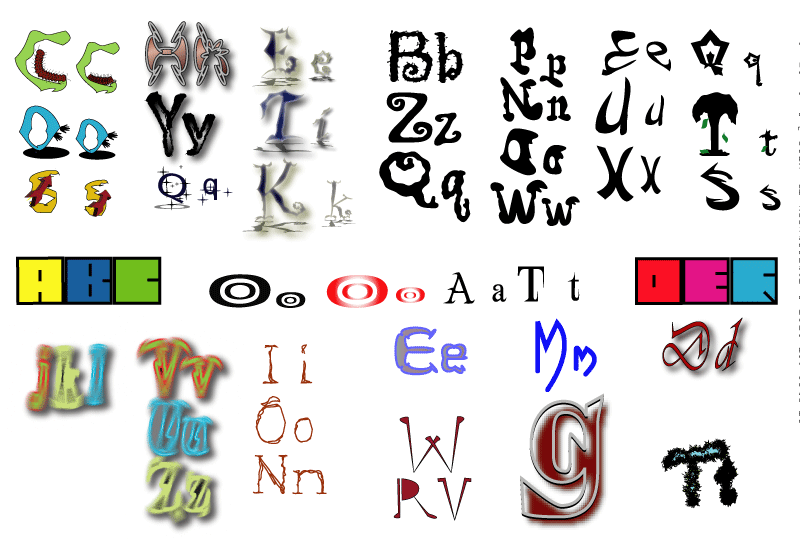
- 4 Thumbnails - Unique Letter Forms - 2-3 letters *see illustration
- Typeset - layout Zao-Tse Quote - 4 Thumbnails / Variations
Vocabulary:
Kerning
Presentations:
Artists:
Matthew Carter - http://en.wikipedia.org/wiki/Matthew_Carter
Typefaces include :
|
|
|
Jan Tschichold - http://en.wikipedia.org/wiki/Jan_Tschichold
Typefaces include:
- Transit (1931)
- Saskia (1931/1932)
- Zeus (1931)
- Sabon (1966/1967) - [1], named after Jacques Sabon.
Guillaume Appollinaire - http://en.wikipedia.org/wiki/Calligrammes
Reading:
Typography Resources
Working
with type - additional - work up a font face of your own design -
functionality
is not required.
-
Parts of the Letter
- Typography History Sampler - http://www.basearts.com/curriculum/typohist/
-
Misc. http://www.basearts.com/curriculum/typoGraphyGraphics/
Johannes Gutenberg
http://en.wikipedia.org/wiki/Johannes_Gutenberg
Bob Dylan Subterranean Homesick Blues - A HAND LETTERING EXPERIENCE
http://vimeo.com/49556689
-------
Flavorpill
The Most Iconic Film Title Sequences of All Time
http://blog.basearts.com/?p=593
---
From: Forest Giulietti
Subject: Opening Titles: Scott Pilgrim VS. The World
This is what I was suggesting in class today for cool openings.
http://www.youtube.com/watch?v=5h1TSN6dIGg
Lecture:
Typography continues...
 Max Naylor
Lab:
Sketchbook:
Project/Assignment:
2nd round revisions - unique letterforms-
Thumbnails - Lao Tse panagrams
Vocabulary:
panagram
Presentations:
Artisits:
Reading:
Panagram - Texts used to demonstrate typefaces
A sentence that uses all of the alphabet (a pangram), such as "The quick brown fox jumps over the lazy dog", is often used as a design aesthetic tool to demonstrate the personality of a typeface's characters in a setting (because it displays all the letters of the alphabet). For extended settings of typefaces graphic designers often use nonsense text (commonly referred to as greeking), such as lorem ipsum or Latin text such as the beginning of Cicero's In Catilinam. Greeking is used in typography to determine a typeface's colour, or weight and style, and to demonstrate an overall typographic aesthetic prior to actual type setting. - wikipedia
Inside the Prosthetic Imaginary: An Interview with Sara Hendren
http://rhizome.org/editorial/2012/oct/4/inside-prosthetic-imaginary-interview-sara-hendren/
Search Sites:
The Golden Ratio
http://en.wikipedia.org/wiki/Golden_ratio
http://mathworld.wolfram.com/GoldenRatio.html
Font characteristics
Character height =
Weight
Stroke width, called weight - roman, regular, bold, thin, italic/oblique thickness of the character outlines relative to height
- Hairline
- Thin
- Ultra-light
- Extra-light
- Light
- Book
- Normal / regular / roman / plain
- Medium
- Demi-bold / semi-bold
- Bold
- Extra-bold / extra
- Heavy
- Black
- Extra-black
- Ultra-black / ultra
- (normal, regular and plain)
Slope - Style, Angle - normal, roman or upright
Width - Character Width - compressed, condensed or narrow. proportional or monospaced(fixed-width), (tabular) digits,
Optimal size
Poster - larger than 72 point
Display - 19–72 point
Subhead - 14–18 point
(Regular) - 10–13 point
Small Text (SmText) - 8–10 point
Caption - 6–8 point
Metrics
Font metrics refers to metadata consisting of numeric values relating to size and space in the font overall, or in its individual glyphs. Font-wide metrics include cap height, x-height, ascender height, descender depth, and the font bounding box.
Serifs
Lecture:
Lab:
Sketchbook:
Project/Assignment:
Vocabulary:
Presentations:
Lecture:
Lab:
Sketchbook:
Project/Assignment:
Vocabulary:
Presentations:
Artists:
Search Sites:
Creative Commons is a nonprofit organization that offers flexible copyright licenses for creative works.
http://creativecommons.org/ Electronic Frontier Foundation
http://www.eff.org
Intellectual Property Online: Patent, Trademark, Copyright
http://www.eff.org/IP/
U.S. Copyright Office
http://www.copyright.gov
Digimarc
www.digimarc.com
http://www.digimarc.com/mypicturemarc/
The Free Expression Policy Project
http://www.fepproject.org/fepp/fairuseintro.html


